Note
Click here to download the full example code
Data Vis: Plotting discrete variables as stacked bar charts
Currently, a somewhat contrived example of add_stacked_bars.
import pandas as pd
from matplotlib import cm
from matplotlib import pyplot as plt
from upsetplot import UpSet
TITANIC_URL = (
"https://raw.githubusercontent.com/datasciencedojo/datasets/master/titanic.csv" # noqa
)
df = pd.read_csv(TITANIC_URL)
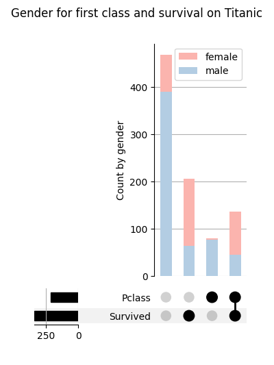
# Show UpSet on survival and first classs
df = df.set_index(df.Survived == 1).set_index(df.Pclass == 1, append=True)
upset = UpSet(df, intersection_plot_elements=0) # disable the default bar chart
upset.add_stacked_bars(
by="Sex", colors=cm.Pastel1, title="Count by gender", elements=10
)
upset.plot()
plt.suptitle("Gender for first class and survival on Titanic")
plt.show()
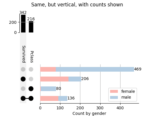
upset = UpSet(
df, show_counts=True, orientation="vertical", intersection_plot_elements=0
)
upset.add_stacked_bars(
by="Sex", colors=cm.Pastel1, title="Count by gender", elements=10
)
upset.plot()
plt.suptitle("Same, but vertical, with counts shown")
plt.show()
Total running time of the script: ( 0 minutes 0.654 seconds)